Dynamic cell visualization
Consider the following scenario: you have processed your samples using the Molecular pixelation (MPX) protocol and after analyzing the data you have made intriguing discoveries about changes in the abundance and spatial arrangement of a few proteins in a particular population of cells. Communicating your findings to your peers is one of the critical steps for better understanding of the data.
Creating the right visualization to communicate you findings is always a challenge, but when done effectively, it becomes a powerful tool to get your message across. In our tutorials section, we provide a variety of examples on how to create different types of visualizations after performing MPX data analysis so feel free to take a look for some inspiration. In this post, we will focus on how to visualize spatial patters on individual cells, which is a frequent request from users who are looking to present their findings. We have already covered how to visualize spatial patterns in a static way in this tutorial, but here we will show you how to create dynamic visualizations. At the end of this post you will have a dynamic 3D visualization of a cell with a protein of interest rotating in 3D such as the one below.
Selecting the cells to visualize
When it comes to MPX data, every single cell is a dataset on its own -
we can pick out any protein(s) and visualize its abundance in its 3D
representation. We can also visualize the presence of spatial patters
such as polarization (clustering) of a protein or colocalization of the
proteins pairs. Let’s start by selecting a few cells to visualize. For
this example, we will be using one of our public
datasets
which consists of resting and PHA-stimulated peripheral mononuclear
blood cells (PBMCs) from a healthy donor. We will be working with
pixelator to process the data and plotly to create the dynamic
visualizations.
The dataset demonstrated here is version 0.18.x, which is an old
version compared to the current one. However, the rest of the code works
as it downloads the right version of the data.
As this demonstration is geared towards creating dynamic visualizations, we will skip the majority pre-processing and analytical steps such as normalization, clustering, and differential analyses. Detailed instructions on how to perform all of these steps are available in the Data Analysis section. We will inspect the polarity of a few proteins and one that is affected by PHA stimulation. Let’s start by loading the data and looking at the polarity scores.
Show the code
import os
import pandas as pd
import numpy as np

from pathlib import Path
from pixelator import read, simple_aggregate

import plotly.graph_objects as go
import plotly.io as pio
from plotly.subplots import make_subplots
import imageio

from scipy.stats import norm
import scipy as sp

import seaborn as sns
import matplotlib.pyplot as plt
To start, we can download the data files from the public dataset and
then load them with pixelator.
Show the code
DATA_DIR = Path("path to your data directory")

baseurl = "https://pixelgen-technologies-datasets.s3.eu-north-1.amazonaws.com/mpx-datasets/pixelator/0.18.x/technote-v1-vs-v2-immunology-II"

!curl -L -O -C - --create-dirs --output-dir {DATA_DIR} "{baseurl}/Sample05_V2_PBMC_r1.layout.dataset.pxl"
!curl -L -O -C - --create-dirs --output-dir {DATA_DIR} "{baseurl}/Sample07_V2_PHA_PBMC_r1.layout.dataset.pxl"

data_files = [
    DATA_DIR / "Sample05_V2_PBMC_r1.layout.dataset.pxl",
    DATA_DIR / "Sample07_V2_PHA_PBMC_r1.layout.dataset.pxl",
]
We only perform minimal quality control by filtering aggregates and graph components (putative cells) with fewer than 8000 molecules. Discarding small graph components is a common practice in MPX data quality control and is done to minimize the chance of including artifacts in the analysis.
Show the code
pg_data_combined = simple_aggregate(
    ["Control", "Stimulated"], [read(path) for path in data_files]
)

components_to_keep = pg_data_combined.adata[
    (pg_data_combined.adata.obs["molecules"] >= 8000)
    & (pg_data_combined.adata.obs["tau_type"] == "normal")
].obs.index

pg_data_combined = pg_data_combined.filter(
    components=components_to_keep
)
Now we can take a look at the polarity scores for the proteins in the resting and PHA-stimulated PBMCs. We will order them by the variance of the polarity scores.
Show the code
polarization = pg_data_combined.polarization

# Calculate the variance of morans_z for each marker
marker_variance = (
    polarization.groupby("marker")["morans_z"].var().sort_values(ascending=False)
)

# Find markers present in both conditions
markers_in_both = polarization.groupby("marker")["sample"].nunique() == 2
markers_to_plot = markers_in_both[markers_in_both].index

# Filter the data and recalculate variance
filtered_polarization = polarization[polarization["marker"].isin(markers_to_plot)]
filtered_marker_variance = (filtered_polarization
    .groupby("marker")["morans_z"]
    .var()
    .sort_values(ascending=False)
)


top_20_markers = filtered_marker_variance.head(20).index
top_20_polarization = filtered_polarization[filtered_polarization["marker"].isin(top_20_markers)]


plt.figure(figsize=(10, 8))
sns.stripplot(
    y="marker",
    x="morans_z",
    hue="sample",
    data=top_20_polarization,
    jitter=0.2,
    alpha=0.6,
    dodge=True,
    size=2,
    order=top_20_markers,
    palette="Set2"
)

plt.ylabel("", fontsize=14)
plt.xlabel("Moran's Z", fontsize=14)
plt.legend(title="Sample", loc="best", bbox_to_anchor=(1, 0.5))
plt.title("Top 20 Markers by Variance in Moran's Z", fontsize=16)
plt.tight_layout()
plt.show()
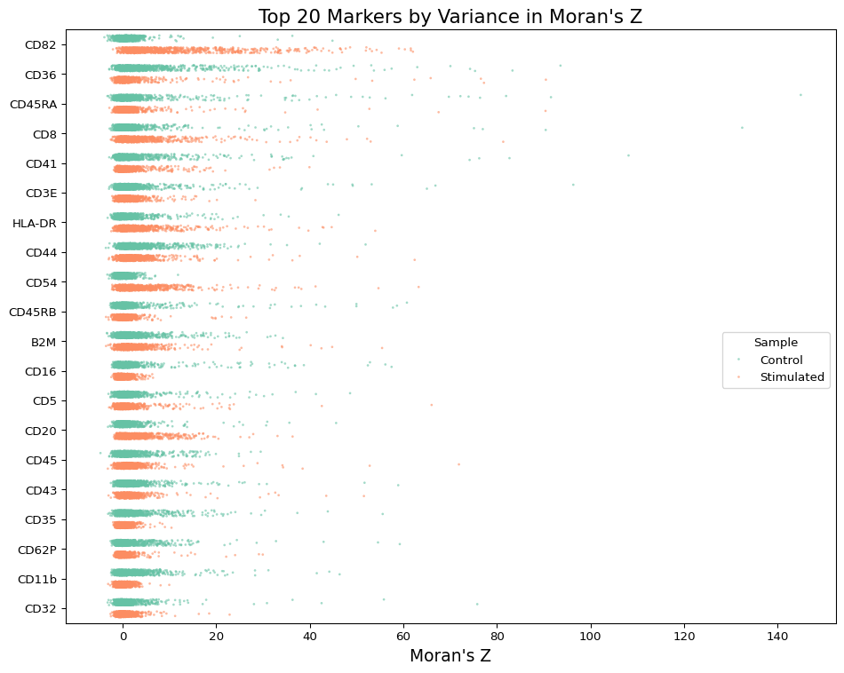
The plot above shows the polarity scores for the proteins in the resting and PHA-stimulated PBMCs. We can see that CD54 is one protein that is more polarized on the surface of PHA-stimulated cells. Let’s look at some of the most and least polarized cells for this protein.
The data in the following table is correct with regards of cell IDs in
the 0.18.x version. However, if you are running with newer versions of
the data processing pipeline (>=0.19.x), the cell IDs should be
different. You can read further about this change
here.
Show the code
# Show the most and least polarized cells for CD54
cd54_pol_scores = pd.concat(
    [
        polarization[polarization["marker"] == "CD54"]
        .sort_values("morans_z", ascending=False)
        .head(10),
        polarization[polarization["marker"] == "CD54"]
        .sort_values("morans_z", ascending=False)
        .tail(10),
    ]
).reset_index(drop=True)[["marker", "morans_z", "morans_p_adjusted", "component"]]

cd54_pol_scores
| marker | morans_z | morans_p_adjusted | component | |
|---|---|---|---|---|
| 0 | CD54 | 63.283062 | 0.000000e+00 | RCVCMP0000058_Stimulated |
| 1 | CD54 | 54.692044 | 0.000000e+00 | RCVCMP0000891_Stimulated |
| 2 | CD54 | 41.241542 | 0.000000e+00 | RCVCMP0001376_Stimulated |
| 3 | CD54 | 38.210696 | 0.000000e+00 | RCVCMP0000183_Stimulated |
| 4 | CD54 | 37.633569 | 2.847600e-307 | RCVCMP0000353_Stimulated |
| 5 | CD54 | 36.843940 | 1.564987e-294 | RCVCMP0000457_Stimulated |
| 6 | CD54 | 32.775086 | 4.070806e-233 | RCVCMP0000669_Stimulated |
| 7 | CD54 | 32.499349 | 3.224146e-229 | RCVCMP0000506_Stimulated |
| 8 | CD54 | 31.952697 | 1.383951e-221 | RCVCMP0001006_Stimulated |
| 9 | CD54 | 29.292630 | 2.981691e-186 | RCVCMP0000131_Stimulated |
| 10 | CD54 | -2.260161 | 9.477499e-02 | RCVCMP0002291_Control |
| 11 | CD54 | -2.277757 | 8.773997e-02 | RCVCMP0000323_Stimulated |
| 12 | CD54 | -2.286220 | 9.003494e-02 | RCVCMP0000893_Control |
| 13 | CD54 | -2.327197 | 8.304407e-02 | RCVCMP0001648_Control |
| 14 | CD54 | -2.382091 | 7.428153e-02 | RCVCMP0000359_Control |
| 15 | CD54 | -2.398852 | 7.161585e-02 | RCVCMP0001396_Control |
| 16 | CD54 | -2.752902 | 3.170127e-02 | RCVCMP0001820_Control |
| 17 | CD54 | -2.763834 | 3.082786e-02 | RCVCMP0001087_Control |
| 18 | CD54 | -2.937040 | 1.970307e-02 | RCVCMP0000298_Control |
| 19 | CD54 | -3.269083 | 7.486896e-03 | RCVCMP0001490_Control |
Visualizing the spatial distribution of CD54
We can see that all of the most polarized cells for CD54 are
PHA-stimulated cells, while the least polarized cells are mostly resting
cells. Let’s visualize the spatial distribution of CD54 in one of the
most but also least polarized cells. We will first compute the $G_i$
(local G) score and set the neighborhood size to 4 using k = 4. Local
G is a Z score that measures how much the marker counts in a local
neighborhood deviates from the global mean. It will help us visualize
the spatial distribution of CD54 more clearly compared to when we use
the raw counts.
Show the code
high_pol_cell = cd54_pol_scores.iloc[0]["component"]
low_pol_cell = cd54_pol_scores.iloc[13]["component"]

def process_graph(pg_data, component, k=4):
    graph = pg_data.graph(component, simplify=True, use_full_bipartite=True)
    gi_mat = graph.local_g(k=k, normalize_counts=False, use_weights=True)
    layout_data = graph.layout_coordinates(
        "wpmds_3d", only_keep_a_pixels=False, get_node_marker_matrix=True
    )
    return graph, gi_mat, layout_data

def process_values(gi_mat, marker="CD54", quantile=0.99):
    vals = gi_mat[marker]
    threshold = vals.quantile(quantile)
    vals_clipped = vals.clip(upper=threshold)
    max_abs_val = max(abs(vals_clipped))
    return vals, vals_clipped, max_abs_val

plot_components = [low_pol_cell, high_pol_cell]
data = {}

for component in plot_components:
    graph, gi_mat, layout_data = process_graph(pg_data_combined, component)
    vals, vals_clipped, max_abs_val = process_values(gi_mat)

    data[component] = {
        "graph": graph,
        "gi_mat": gi_mat,
        "layout_data": layout_data,
        "vals": vals,
        "vals_clipped": vals_clipped,
        "max_abs_val": max_abs_val
    }
Let’s create a static 3D plot of the cell with the spatial distribution of CD54. We will use the local G scores for CD54 to color the nodes of the cell graph layout.
Show the code
fig = make_subplots(
    rows=1,
    cols=2,
    specs=[[{"type": "scene"}, {"type": "scene"}]],
    subplot_titles=("Control", "Stimulated"),
)

fig.add_trace(
    go.Scatter3d(
        x=data[plot_components[0]]["layout_data"]["x"],
        y=data[plot_components[0]]["layout_data"]["y"],
        z=data[plot_components[0]]["layout_data"]["z"],
        mode="markers",
        marker=dict(
            size=4,
            opacity=1,
            color=data[plot_components[0]]["vals_clipped"],
            colorscale="RdBu",
            cmin=-data[plot_components[0]]["max_abs_val"],
            cmax=data[plot_components[0]]["max_abs_val"],
            reversescale=True,
            showscale=True,
            colorbar=dict(
                title=dict(
            text="CD54 Score",
                    side="right",
                    font=dict(size=14, family="Arial, sans-serif"),
        ),
                tickfont=dict(size=12, family="Arial, sans-serif"),
                len=0.75,
                thickness=10,
                x=0.45,
                y=0.5,
                yanchor="middle",
            ),
        ),
        showlegend=False,
    ),
    row=1,
    col=1,
)

fig.add_trace(
    go.Scatter3d(
        x=data[plot_components[1]]["layout_data"]["x"],
        y=data[plot_components[1]]["layout_data"]["y"],
        z=data[plot_components[1]]["layout_data"]["z"],
        mode="markers",
        marker=dict(
            size=4,
            opacity=1,
            color=data[plot_components[1]]["vals_clipped"],
            colorscale="RdBu",
            cmin=-data[plot_components[1]]["max_abs_val"],
            cmax=data[plot_components[1]]["max_abs_val"],
            reversescale=True,
            showscale=True,
            colorbar=dict(
                title=dict(
            text="CD54 Score",
                    side="right",
                    font=dict(size=14, family="Arial, sans-serif"),
        ),
                tickfont=dict(size=12, family="Arial, sans-serif"),
                len=0.75,
                thickness=10,
                x=1.05,
                y=0.5,
                yanchor="middle",
            ),
        ),
        showlegend=False,
    ),
    row=1,
    col=2,
)

fig.update_layout(
    width=700,
    height=350,
)


for i in [1, 2]:
    fig.update_scenes(
        xaxis=dict(
            showbackground=False,
            showticklabels=False,
            showgrid=False,
            zeroline=False,
            visible=False,
        ),
        yaxis=dict(
            showbackground=False,
            showticklabels=False,
            showgrid=False,
            zeroline=False,
            visible=False,
        ),
        zaxis=dict(
            showbackground=False,
            showticklabels=False,
            showgrid=False,
            zeroline=False,
            visible=False,
        ),
        row=1,
        col=i,
    )

fig.show()
The plot above shows the spatial distribution of CD54 in a one highly polarized cell from the PHA-stimulated sample alongside with a cell low polarity score reflecting a randomly dispersed CD54 molecules. The color scale represents the local G scores for CD54, where red indicates higher than average abundance and blue indicates lower than average abundance. We can see that CD54 is mostly clustered on one pole of the cell’s surface.
Although these structures may appear cell-like, they do not portray the actual shape and surface of cells but rather a representation of the spatial distribution of the protein.
Creating a dynamic visualization
This visualization above already gives us a good idea of the spatial
distribution of CD54 in this cell, but we can make it more interactive
by creating a dynamic visualization. We can use different angles of this
cell graph layout to create an animated 3D plot of the rotating cell.
Press the rotate button to see the cell spinning in 3D.
Show the code
fig = go.Figure(
    data=[
        go.Scatter3d(
            x=data[plot_components[1]]["layout_data"]["x"],
            y=data[plot_components[1]]["layout_data"]["y"],
            z=data[plot_components[1]]["layout_data"]["z"],
            mode="markers",
            marker=dict(
                size=8,
                opacity=1,
                colorscale="RdBu",
                cmin=-data[plot_components[1]]["max_abs_val"],
                cmax=data[plot_components[1]]["max_abs_val"],
                reversescale=True,
            ),
            marker_color=data[plot_components[1]]["vals_clipped"],
        ),
    ]
)

x_eye, y_eye, z_eye = -1, 1.3, 0.5


def rotate_z(x, y, z, theta):
    w = x + 1j * y
    return np.real(np.exp(1j * theta) * w), np.imag(np.exp(1j * theta) * w), z


frames = []
for t in np.arange(0, 15, 0.02):
    xe, ye, ze = rotate_z(x_eye, y_eye, z_eye, -t)
    frames.append(go.Frame(layout=dict(scene_camera_eye=dict(x=xe, y=ye, z=ze))))

fig.frames = frames


def frame_args(duration):
    return {
        "frame": {"duration": duration},
        "mode": "immediate",
        "fromcurrent": True,
        "transition": {"duration": duration},
    }


fig.update_layout(
    title=f"CD54 / {plot_components[1]}",
    width=700,
    height=500,
    scene_camera_eye=dict(x=x_eye, y=y_eye, z=z_eye),
    scene=dict(
        xaxis=dict(
            showbackground=False,
            showticklabels=False,
            showgrid=False,
            zeroline=False,
            visible=False,
        ),
        yaxis=dict(
            showbackground=False,
            showticklabels=False,
            showgrid=False,
            zeroline=False,
            visible=False,
        ),
        zaxis=dict(
            showbackground=False,
            showticklabels=False,
            showgrid=False,
            zeroline=False,
            visible=False,
        ),
    ),
    updatemenus=[
        {
            "buttons": [
                {
                    "args": [None, frame_args(50)],
                    "label": "Rotate",
                    "method": "animate",
                },
                {
                    "args": [
                        [None],
                        {
                            "frame": {"duration": 0},
                            "mode": "immediate",
                        },
                    ],
                    "label": "Freeze",
                    "method": "animate",
                },
            ],
            "direction": "left",
            "pad": {"r": 10, "t": 70},
            "showactive": False,
            "type": "buttons",
            "x": 0.1,
            "xanchor": "right",
            "y": 0.3,
            "yanchor": "top",
        }
    ],
)

fig.show()
Saving the results
To save the animation as a GIF, which you can use in your presentations or reports, run the following code:
Show the code
fig = go.Figure(
    data=[
        go.Scatter3d(
            x=data[plot_components[1]]["layout_data"]["x"],
            y=data[plot_components[1]]["layout_data"]["y"],
            z=data[plot_components[1]]["layout_data"]["z"],
            mode="markers",
            marker=dict(
                size=8,
                opacity=1,
                colorscale="RdBu",
                cmin=-data[plot_components[1]]["max_abs_val"],
                cmax=data[plot_components[1]]["max_abs_val"],
                reversescale=True,
            ),
            marker_color=data[plot_components[1]]["vals_clipped"],
        ),
    ]
)

x_eye = -1
y_eye = 1.3
z_eye = 0.5

fig.update_layout(
    title=f"CD54 / {plot_components[1]}",
    width=800,
    height=600,
    scene_camera_eye=dict(x=x_eye, y=y_eye, z=z_eye),
    scene=dict(
        xaxis=dict(
            showbackground=False,
            showticklabels=False,
            showgrid=False,
            zeroline=False,
            visible=False,
        ),
        yaxis=dict(
            showbackground=False,
            showticklabels=False,
            showgrid=False,
            zeroline=False,
            visible=False,
        ),
        zaxis=dict(
            showbackground=False,
            showticklabels=False,
            showgrid=False,
            zeroline=False,
            visible=False,
        ),
    ),
)

if not os.path.exists("frames"):
    os.makedirs("frames")

frames = []
for i, t in enumerate(np.arange(0, 15, 0.1)):
    xe, ye, ze = rotate_z(x_eye, y_eye, z_eye, -t)
    frame = go.Frame(layout=dict(scene_camera_eye=dict(x=xe, y=ye, z=ze)))
    frames.append(frame)

    # Save each frame as a PNG file
    pio.write_image(
        fig.update_layout(scene_camera_eye=dict(x=xe, y=ye, z=ze)),
        f"frames/frame_{i:03d}.png",
    )

# Create GIF from PNG files
images = []
for filename in sorted(os.listdir("frames")):
    if filename.endswith(".png"):
        images.append(imageio.imread(f"frames/{filename}"))

imageio.mimsave("animation.gif", images, duration=0.05)  # 50ms per frame

# Clean up PNG files
for filename in os.listdir("frames"):
    if filename.endswith(".png"):
        os.remove(f"frames/{filename}")
os.rmdir("frames")
If you would rather work in R to create the animation, feel free to download the equivalent code.
With this, you have created a dynamic visualization of the spatial distribution of CD54 in a cell. You can use this animation in your presentations or reports to better illustrate the spatial aspect of your findings.